Gauging creativity on the scale of actual math to myth…
Hey, wondering… Apple’s logo is quite attractive. And so is Pepsi. McDonald’s golden arches are also wonderfully designed. What if I tell you that these are beyond creativity and are engineered into complex numerical dramas called the Fibonacci series? Most of you may know this, but for others, this could be a disturbing nudge.
We are all familiar with the Golden Ratio or the Divine Ratio. But since my diving skills are amazing, I wanted to understand them in depth. I found the internet flooded with some of these examples….
The golden ratio has been a recurring common element in everything from architecture to paintings. We are aware that the iconic Taj Mahal is a masterpiece of civil engineering, a complex of interwoven symmetrical structures that were built employing the golden ratio.
The Great Pyramid of Giza, also referred to as the Pyramid of Khufu was constructed in the early 26th century and encodes the golden ratio along with other complex numerical correlations. The old masonry architecture is based on the ratio of 11:7, which is an excellent approximation to 1.6.
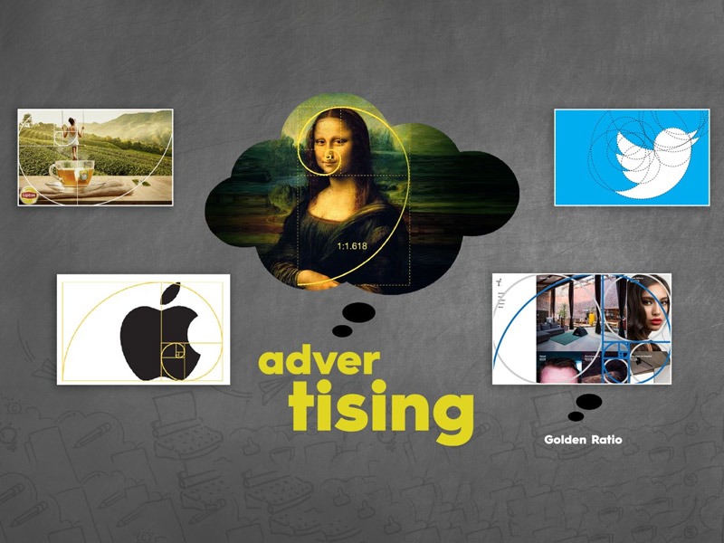
It’s interesting to note that the golden ratio may be seen in Leonardo Da Vinci’s iconic painting of the Mona Lisa. Try drawing a rectangle around her face, the rectangle could further be divided horizontally using her eyes; and the measurements turn out to be in the golden ratio. Also, at this point, Mona Lisa appears to be staring at you from every angle. The golden cut produces astounding effects and can produce one-of-a-kind art pieces in the world.
The same is true to create designs and logos in the advertising industry. Take for example Apple’s or Twitter’s logo. These validate the golden ratio as the leaf of the apple or wings of the bird are in the right proportion and balance the design well. Lipton’s creative or print ad also has the golden ratio applied to it. Every element in the creative has been rightly justified with the amount of space and proportion allotted.
However, are all creatives and designs in advertising made using the golden ratio? Sure, giving the right weightage to the elements in any design is important but the ratio may not necessarily be in line with the golden ratio.
Designers, over time, get an idea about how to balance elements in a creative and that could inadvertently turn out to be the golden ratio but application of the same never is intentional. The intention usually is to make the elements of the design look in harmony.
I am also aware that when you look at any brand’s logo, you and others might eventually figure out some part of the golden ratio being employed. But, to be honest, anyone can fit in circles in almost any figure.
Others contend that the adoption of the golden ratio makes designs more appealing. But I and others would also see eye to eye about the colors, the design, and the general focus of any logo, design, or creative.
If I ask you to choose a rectangle from a wide range of shapes, you all will choose different shapes and not just the one that follows the golden ratio. This is due to the fact that something need not be appealing to others if it appeals to you. So, how is the ratio supposed to be some rule? Sure, it could be one of the tools.
Let me ask this straight to all the designers and other creative people, on a scale of one to ten, where would you place the Golden Ratio in terms of usage and priority?